Improving the efficiency of delivery, installation and service by re-designing the primary order management application used by agents
Best Buy offers valued customers the service of their various electronic appliances. Most of these devices can be brought into store to be inspected by agents, however for larger appliances, agents visit customers in home to check and diagnose issues. Agents use an application to manage and process work orders to address these service requests.
This was a mobile application that had been translated from a desktop application. The application was slow and clunky and had poor adoption.
Research
In order to understand challenges, completed ride alongs with agents on multiple house calls across different departments to observe first hand their challenges.
Observations
Agents completed prep work on the desktop application ahead of the house call and then completed it after since it could be left partially saved.
They took pictures with their mobile devices and then chose to upload to the desktop app instead of the mobile one.
Challenges
Not mobile first
The employee experience had been put together in a very short frame of time and was not optimized for a mobile experience.
A majority of the workflows reflected a desktop experience with minor modifications. This resulted in the agents using the desktop application where they had more real estate.
Inefficient IA
The navigation of the application was deep as opposed to broad.
Major workflows required users to step into several screen views and discover functionality. This made it challenging for a user trying to complete functionality in a mobile form factor which is expected to be light and quick.
Poor visibility
The application was meant to be used by various groups and sub-groups of users. Functionality needed to be optimized to be appropriately displayed for each user group.
While the information was available, it was either not highlighted appropriately or not displayed in a manner that would support these user groups.
High Information Density
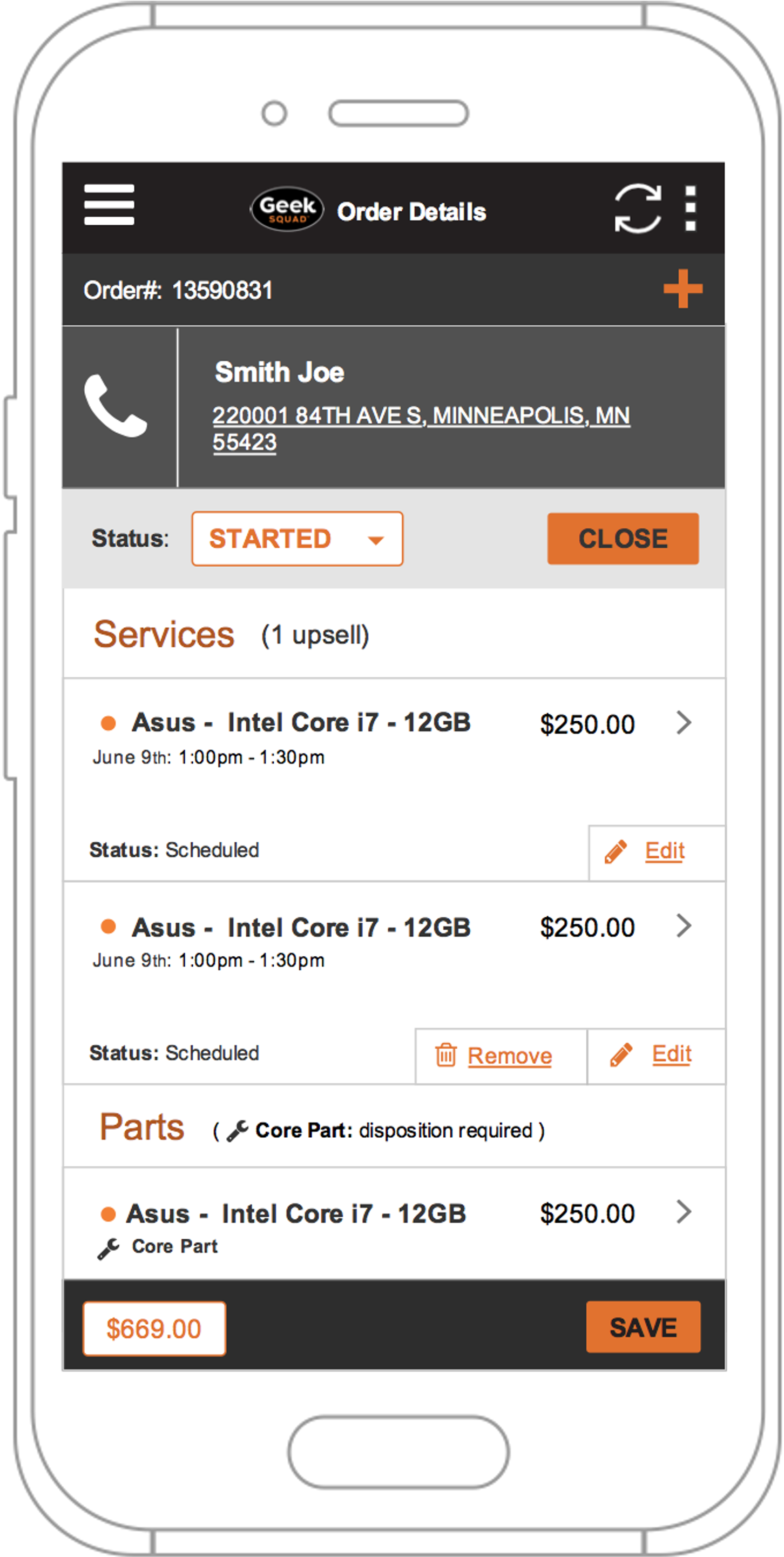
The information displayed on the screen was not optimized to support a user flow. The information density was pretty high and not supported by good usage of color.
This resulted in a challenging user experience.
Before
Approach
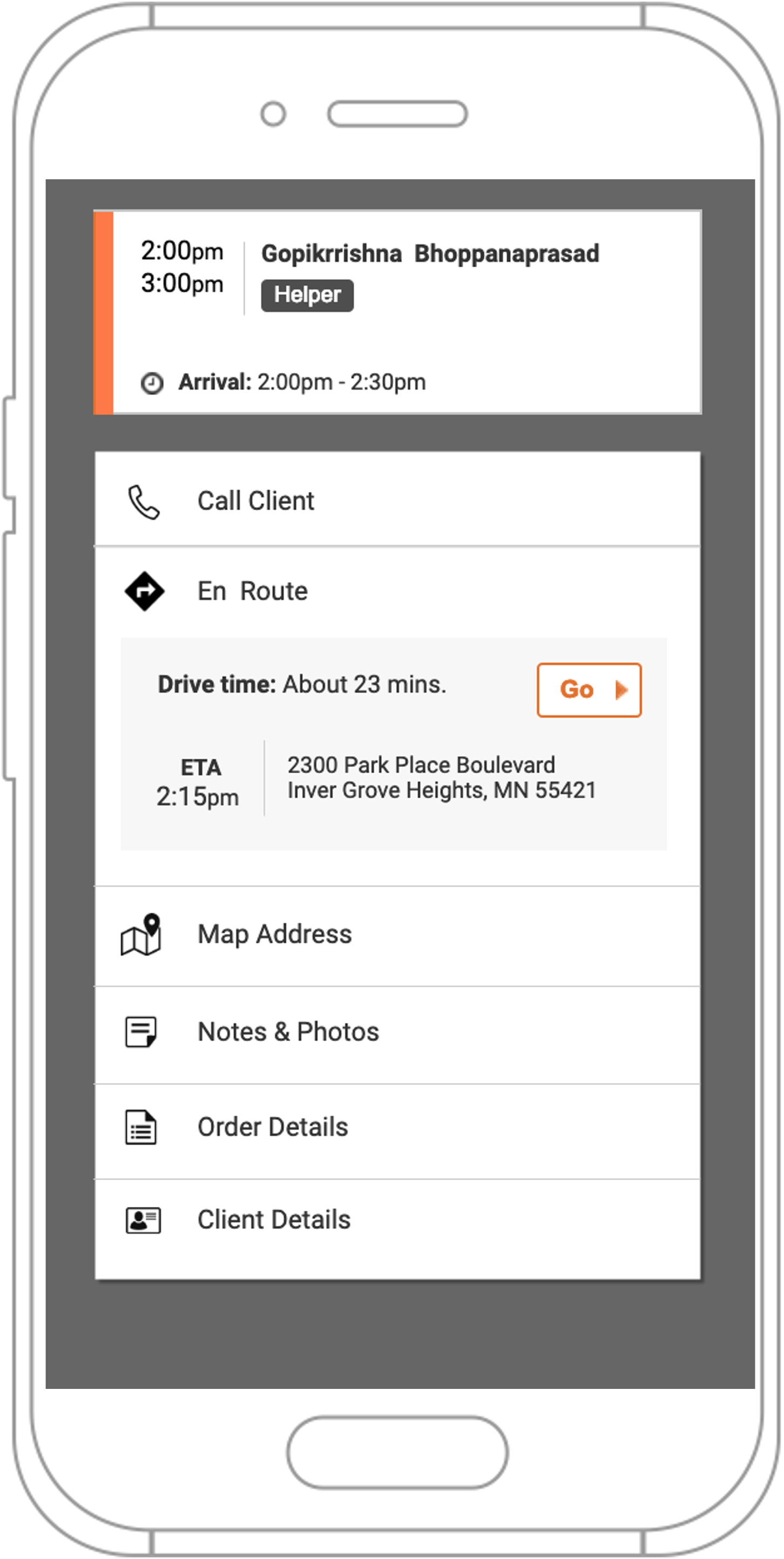
Better presentation rules to drive clear visibility of system status by user type.
Thorough review and reorganizing of information architecture to eliminate unnecessary steps and reduce the depth of the navigation.
Content Audit to reorganize presentation of pertinent content just in time, taking advantage of the mobile form factor.
Reduce information and color density to make only important info visible
After
Impact
Reduced task time
Service task time and admin effort were reduced resulting in higher volume and throughput and increased business.
Increased Adoption
Improved and optimized experience resulted in better adoption and lower reliance on the desktop application.
Reduced training
Agents were able to get started much quicker and time spent on training during onboarding was reduced.


