Re-design of a B2B commerce legacy application, used by 20K + customers distributed across 54 countries
Nike did business through several channels, but the bulk of its sales were through skilled sales people. There was a push to shift to self service through an online channel - nike.net, a B2B application. The application was meant to be used in 54 countries supporting 27 languages for Nike’s global retailers funnelling 4B USD in revenue.
Built in the 90’s the experience and the technology was nowhere close to these lofty expectations.
Challenges
No brand recognition
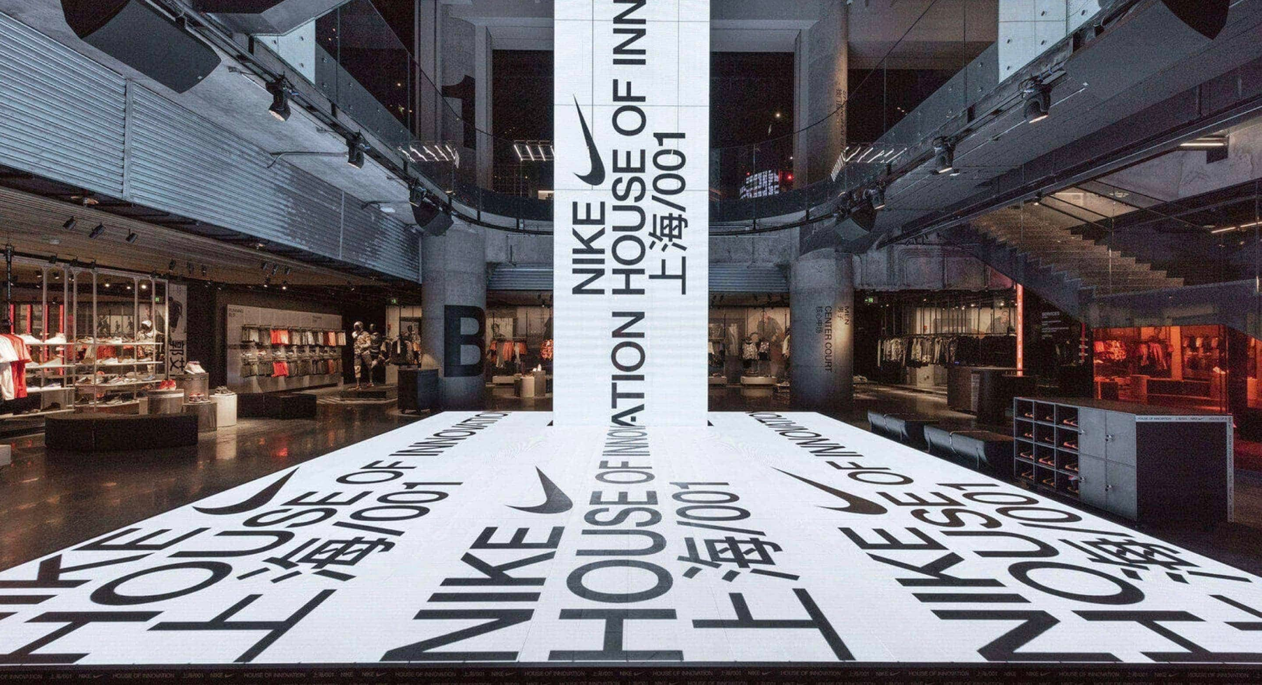
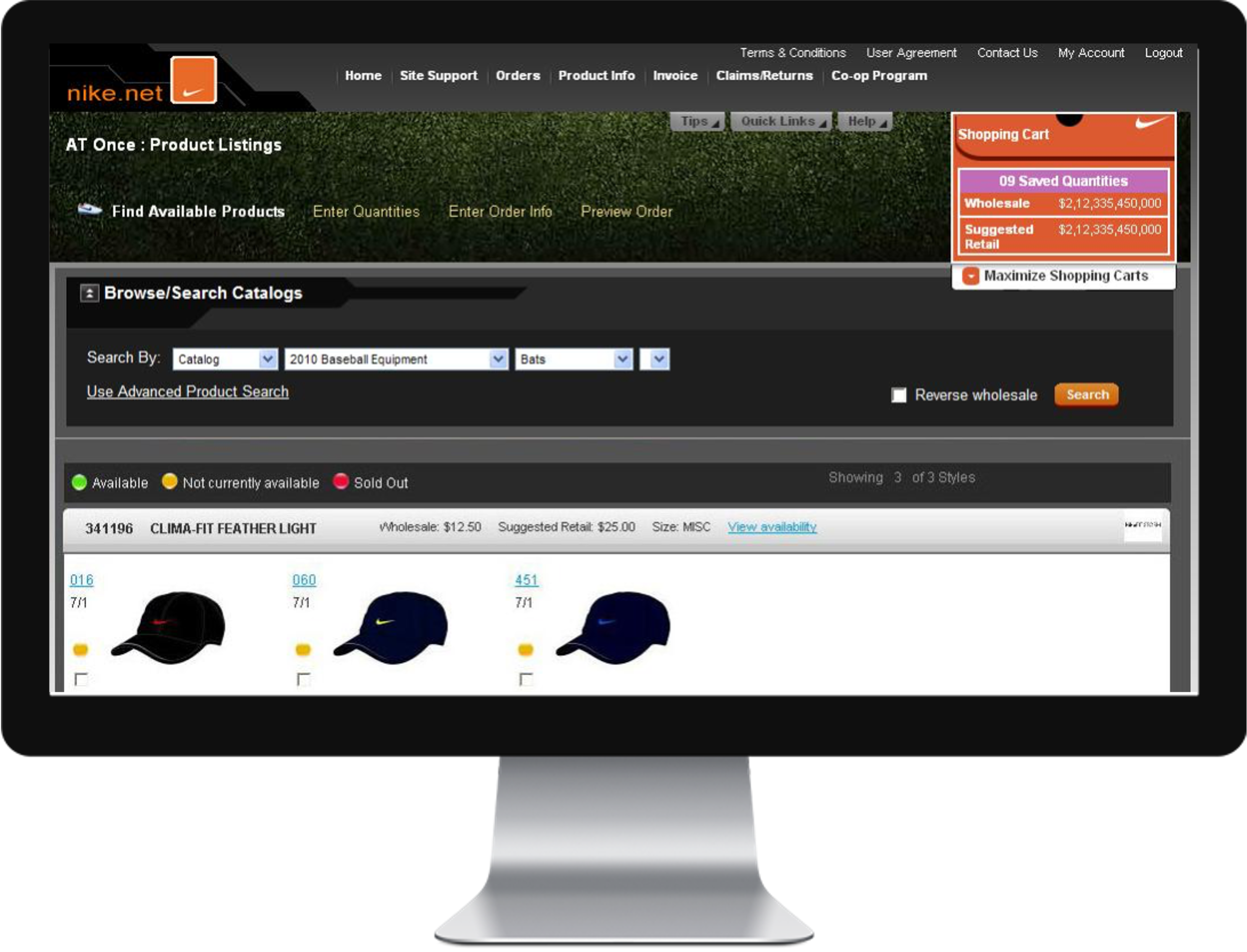
The aesthetic of the website was very dated and did not align with Nike’s brand.
From an optics point of view, it was considered a fail safe for sales staff as opposed to a primary channel
Fractured IA
The application was built around the context of different types of seasonal orders.
As an outcome, each order type was built as an individual experience, subsequently connected through a hub- spoke navigation. No learnability, No consistency and consequently No usage.
No localization
The application was used by businesses that were distributed across 54 countries and 27 languages.
The application was designed to work primarily in English and not built for localization.
Inefficient workflows
Information density of the application was exceptionally high. This meant power users and novice users, which meant a steep learning curve and low adoption.
There is a need for a redesign of the existing functionality and a re-definition of the brand and overall experience of the application.
Approach
Thorough content audit to understand existing flow of information and devise a strategy for information architecture
Visual Redesign to match Nike’s brand aesthetic at the time to lend credence and increase curiosity
Application redesign to organize navigation, page flow, optimization for localization, increased consistency and findability of individual feature sets.
Testing and redesigning to ensure usability and contextualization across multiple geographies
Visual Design
“nike.net now feels like the 4 billion dollar website it is, great job on it! ”
Director, Global Sales and ECommerce
Impact
Reduced time to task
User Testing and Site Analytics indicated a reduction in time to task and higher completion of orders places in session
Reduced customer support volume
Queue for customer support specific to order management observed reduced call volume and duration post release
Increased adoption
Total number of active digital users observed an increase quarter on quarter both locally and globally. This allowed sales partners to optimize efforts and drive business growth
Continuous Delivery
A product vision was crafted working with engineers and business to ensure continuous experience and business improvements to the user base.
A revised search index - current technology did not support SLA’s, proposed search index did not meet the retailer’s mental model.
Approach involved testing of multiple indices, resolving Nike’s style run and color run data structure to match seasonal purchase patterns of retailers
Overhaul of the “future” order capability which originated as an excel sheet and was redesigned to be full fledged in app experience.


